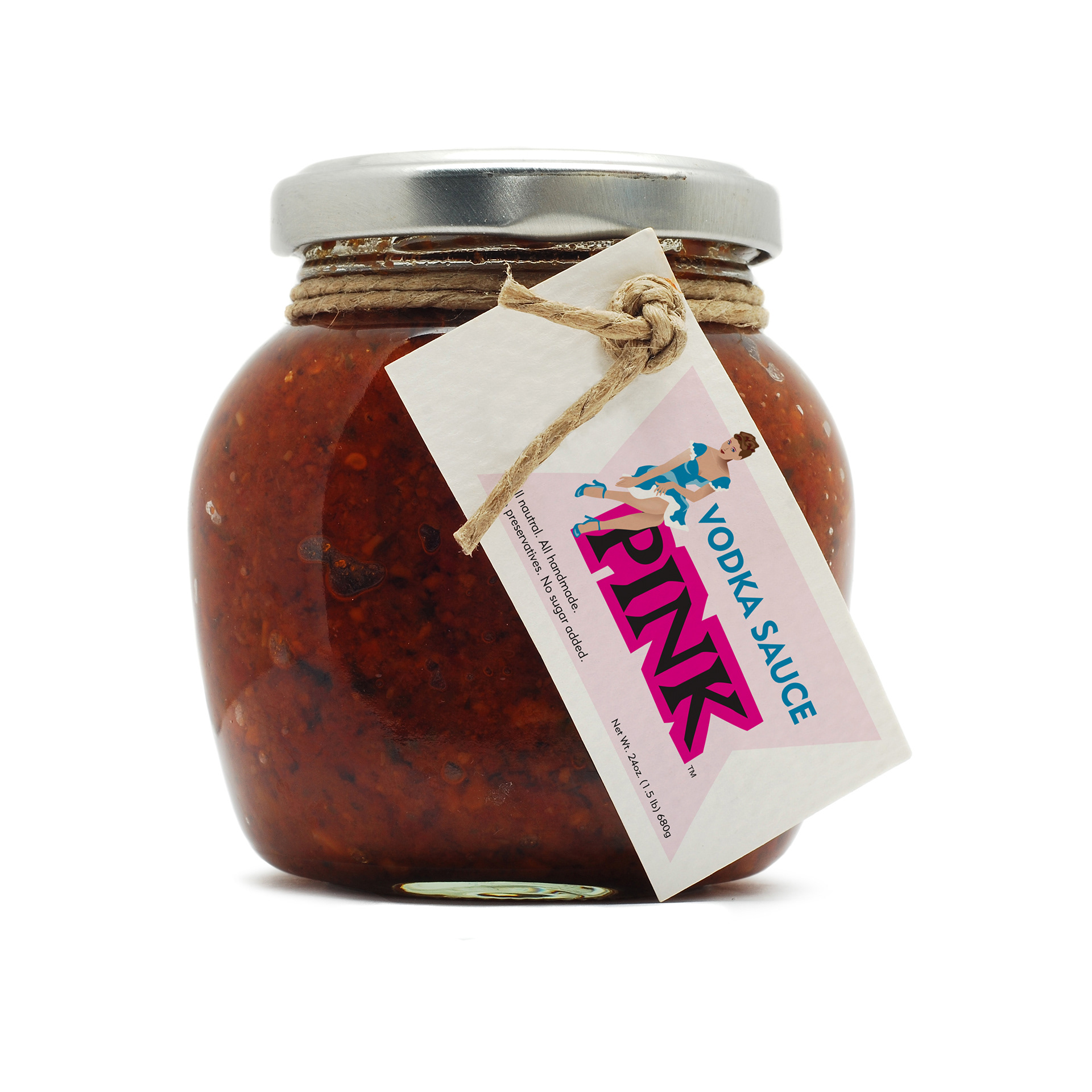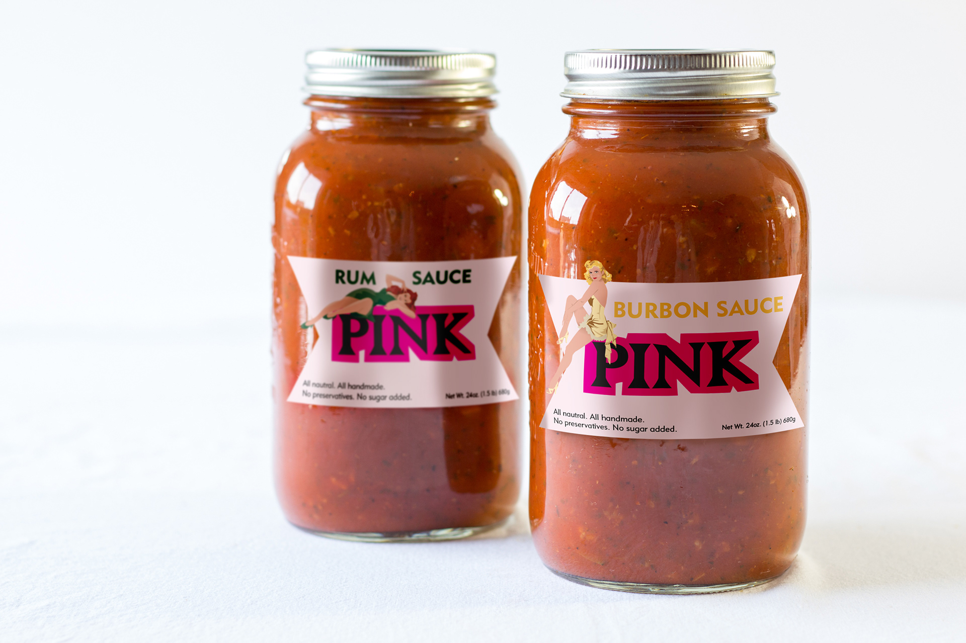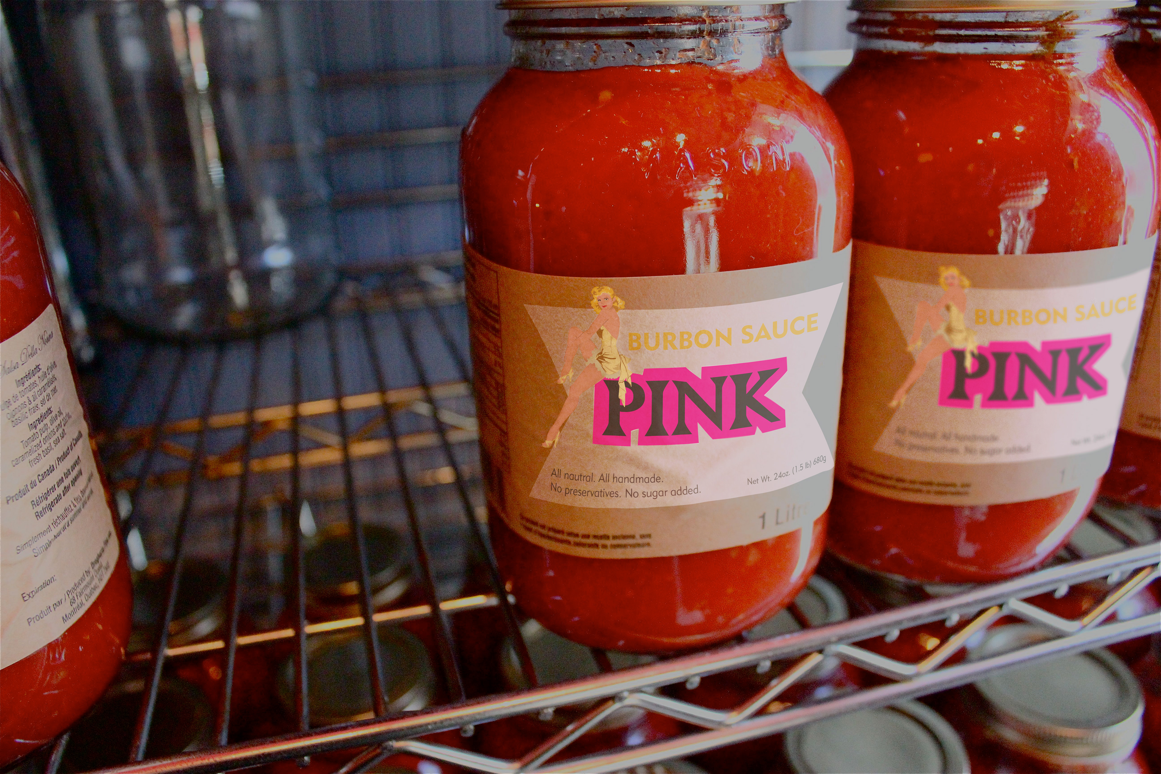
Pink Sauce
Project: The client had various alcohol inspired pasta sauces that needed some packaging. They wanted something "retro" looking. The logo - PINK - also needed to be designed along with each sauce label. To differentiate each sauce, a different pin up girl was created to represent a different flavor. The series of packaging options was part of the pitch to the client.
Responsibility: Logo + packaging design
Responsibility: Logo + packaging design